


Article Outline
- Problem faced
- Solution used
- Codepen Example
- Final CSS code
Problem faced
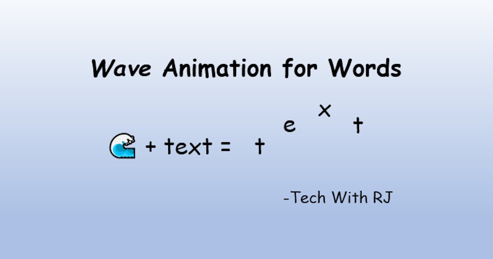
When I was building my personal website, I wanted to make my website more interactive with animations. After putting in some thoughts, I decided to give my title a "wave-like" effect when the user hovered their mouse over it.
Solution Used
After playing around with CSS and HTML, I finally had a favorable result! I will be showing code snippets below!
HTML Code
<div class="title">
<div>T</div>
<div>e</div>
<div>c</div>
<div>h</div>
<div> </div>
<div>W</div>
<div>i</div>
<div>t</div>
<div>h</div>
<div> </div>
<div>R</div>
<div>J</div>
</div>
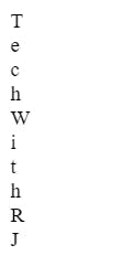
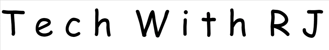
A typical "wave-like" effect means that the words will go up and down linearly. In this case, I was trying to have the title "Tech With RJ". The empty divs are the space in between words. As you can see, all the characters have their own divs and are wrapped inside the "title" div.
Take note of the div's sequence each character is in as we will be using it in the CSS. This is how the title looks now.
Time to add some styling!
CSS Code
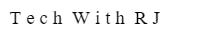
First, we have to turn all the divs into one line.
.title>div {
  display: inline-block;
}
All the divs nested in the
titleclass will have this CSS applied!
Result:
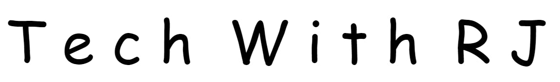
Next, let's make the words bigger and add some font!
.title {
  font-size: 100px;
  font-family: 'Cedarville Cursive', cursive;
}
Result:
Moving forward, let us add some colors to validate that we are hovering!
.title:hover {
  color:  purple;
}
Result:
Time for the animations! We will name our animation wave.
@keyframes wave {
  0%,
  100% {
    transform: translateY(0);
  }
  50% {
    transform: translateY(-3px);
  }
}
Read about translateY() and @keyframes rules
Next, We will set the animations to each div. Take note that we skipped nth-child(5) and nth-child(10) as they were empty divs that acted as spaces. All the div has the same animation name (wave) which we created above, the same animation duration (0.4s), and the animation delay increases at the same rate for a smooth transition.
.title:hover>div:first-child {
  animation-name: wave;
  animation-duration: 0.4s;
  animation-delay: 0.11s;
}

.title:hover>div:nth-child(2) {
  animation-name: wave;
  animation-duration: 0.4s;
  animation-delay: 0.22s;
}

.title:hover>div:nth-child(3) {
  animation-name: wave;
  animation-duration: 0.4s;
  animation-delay: 0.33s;
}

.title:hover>div:nth-child(4) {
  animation-name: wave;
  animation-duration: 0.4s;
  animation-delay: 0.44s;
}

.title:hover>div:nth-child(6) {
  animation-name: wave;
  animation-duration: 0.4s;
  animation-delay: 0.55s;
}

.title:hover>div:nth-child(7) {
  animation-name: wave;
  animation-duration: 0.4s;
  animation-delay: 0.66s;
}

.title:hover>div:nth-child(8) {
  animation-name: wave;
  animation-duration: 0.4s;
  animation-delay: 0.77s;
}

.title:hover>div:nth-child(9) {
  animation-name: wave;
  animation-duration: 0.4s;
  animation-delay: 0.88s;
}


.title:hover>div:nth-child(11) {
  animation-name: wave;
  animation-duration: 0.4s;
  animation-delay: 0.99s;
}

.title:hover>div:nth-child(12) {
  animation-name: wave;
  animation-duration: 0.4s;
  animation-delay: 1.1s;
}
.title:hover>div:nth-child(X) means that when I hover over the div with the class of
title, something will happen to the X child div nested inside thetitlediv.
Codepen Example
Final CSS code
/*Title styles */
.title {
  font-size: 100px;
  font-family: 'Cedarville Cursive', cursive;
}

/*To Make all the divs one line*/
.title>div {
  display: inline-block;
}

.title:hover {
  color:  purple;
}

/* Title animations */
@keyframes wave {

  0%,
  100% {
    transform: translateY(0);
  }
  50% {
    transform: translateY(-3px);
  }
}

.title:hover>div:first-child {
  animation-name: wave;
  animation-duration: 0.4s;
  animation-delay: 0.11s;
}

.title:hover>div:nth-child(2) {
  animation-name: wave;
  animation-duration: 0.4s;
  animation-delay: 0.22s;
}

.title:hover>div:nth-child(3) {
  animation-name: wave;
  animation-duration: 0.4s;
  animation-delay: 0.33s;
}

.title:hover>div:nth-child(4) {
  animation-name: wave;
  animation-duration: 0.4s;
  animation-delay: 0.44s;
}

.title:hover>div:nth-child(6) {
  animation-name: wave;
  animation-duration: 0.4s;
  animation-delay: 0.55s;
}

.title:hover>div:nth-child(7) {
  animation-name: wave;
  animation-duration: 0.4s;
  animation-delay: 0.66s;
}

.title:hover>div:nth-child(8) {
  animation-name: wave;
  animation-duration: 0.4s;
  animation-delay: 0.77s;
}

.title:hover>div:nth-child(9) {
  animation-name: wave;
  animation-duration: 0.4s;
  animation-delay: 0.88s;
}


.title:hover>div:nth-child(11) {
  animation-name: wave;
  animation-duration: 0.4s;
  animation-delay: 0.99s;
}

.title:hover>div:nth-child(12) {
  animation-name: wave;
  animation-duration: 0.4s;
  animation-delay: 1.1s;
}
Thank you for reading!
This was an easy animation. Customize it to your own need and use it in your next project. 😄
If you liked what you see, follow me for similar content and check out my other articles! Subscribe to my newsletter to get updated when I post a new article!